Are you wondering if our bead making how-to's have ended? I can reassure you they have not. The past few days have been crazy hectic. I just haven't had time to put together another tutorial. Instead I've been working to photograph all the jewelry I've made for my Etsy shop's upcoming opening. There are 30 pieces, each requiring 4 or 5 different product shots. That's 120-150 photos, most of which must then be tweaked and resized in PhotoShop Elements before they can be uploaded.. This chore has kept me plenty busy. But tomorrow, instead of shooting jewelry, I plan to remedy the tutorial shortage. So check back again in the next few days.
What you'll find will be a step-by-step for making multicolored, gilded eye candy. These little numbers are loaded with wow factor yet the technique for making them is as easy as making a PB&J sandwich. And you can do it with just four "ingredients," all of which you probably already have. Would I kid you? No way. Stay tuned!
©2014 Lynn Edwards
Tuesday, March 25, 2014
Monday, March 24, 2014
The Car as Art
Paula Guhin, whose Mixed Media Manic blog I follow (see sidebar), recently posted a couple of photos of sculptural art on a hippie van that made me smile. That artist had used old mannequins to add some distinction to his or her vehicle. Paula's photos reminded me of another tricked out vehicle I had seen a couple of years ago in Woodstock -- that's Woodstock, Georgia, not New York. Naturally I had to take a picture of it:
 |
| No way can you drive a car like this and not draw attention. Every inch of the hood, roof and rear deck was covered with toys. You don't see sights like this everyday. |
Sunday, March 23, 2014
A Thought for Sunday
"Sometimes people get the mistaken notion that spirituality is a separate
department of life, the penthouse of existence. But rightly understood,
it is a vital awareness that pervades all realms of our being...
Wherever we may come alive, that is the area in which we are spiritual." -- David Steindl-Rast
Quotation courtesy of Robert Genn, http://artquotes.robertgenn.com
Quotation courtesy of Robert Genn, http://artquotes.robertgenn.com
Saturday, March 22, 2014
Super Fast and Easy Paper Beads
Here's a way to make embellished paper beads very quickly without going to the trouble of getting out your paints and brushes: use paper that's already printed and dress it up with some fast, simple techniques..
Text weight scrapbook papers are good candidates for this method, as are non-glossy old book pages, magazine photos, even junk mail brochures. With this method you can create many different beads in a short period of time.
Start by making a cylindrical base bead. (See my post on 3/19/14 for instructions.)
Next, embellish a piece of scrapbook paper or other paper that has been printed with designs, images or text. Two speedy ways for adding embellishment to printed papers are:
1. You can use a stamp and permanent ink in the color(s) of your choice
2. You can use permanent markers such as Sharpie permanent markers in different colors.
A piece of scrapbook paper with a floral design, say, becomes more intriguing when you use a text stamp to superimpose a "handwritten letter" in cursive writing over it. (Picture scrapbook paper printed with pink and yellow roses overstamped with flowing "handwriting" in crisp black ink. Much more interesting than roses alone.)
Trim the embellished paper to fit the base bead then glue, seal and varnish to complete it.
Whatever design you choose to overstamp with, make sure it's small in scale. Large patterns or designs don't work well for beads.
Use only permanent inks. Let them dry thoroughly before attempting to glue the stamped paper onto the base bead.
These are a lot of fun to use. Here are some ideas to get you started:
Look for small black and white illustrations and color them in with the markers. Pick out the more interesting parts to use for the beads.
Cover printed pieces with small geometric designs in a variety of colors.
Apply scribble patterns or doodles to photos cut from magazines or advertising circulars.
Use fine tip markers to make Zentangle-like patterns.
Use different colors of markers to "color between the lines" on pages of plain text, creating stripes. Or use various colors of markers to shade the lines of text, and use an altogether different color to fill the spaces in between the lines.
When you've made enough embellished papers, following the directions posted earlier on 3/19/14, cut them into small pieces to fit the base beads. To finish the beads, glue on your embellished papers, seal and varnish, and allow to dry. Now your beads are ready to become a new bracelet or necklace.
©2014 Lynn Edwards
Text weight scrapbook papers are good candidates for this method, as are non-glossy old book pages, magazine photos, even junk mail brochures. With this method you can create many different beads in a short period of time.
Start by making a cylindrical base bead. (See my post on 3/19/14 for instructions.)
Next, embellish a piece of scrapbook paper or other paper that has been printed with designs, images or text. Two speedy ways for adding embellishment to printed papers are:
1. You can use a stamp and permanent ink in the color(s) of your choice
2. You can use permanent markers such as Sharpie permanent markers in different colors.
Stamping:
Here's where the fun begins. Printed materials take on a whole different look when lines, patterns, geometric shapes, etc. are superimposed over them. A page of plain text, such as a page from an old textbook, turns into a fine candidate for bead making when you stamp a small floral pattern over it in a contrasting ink color.A piece of scrapbook paper with a floral design, say, becomes more intriguing when you use a text stamp to superimpose a "handwritten letter" in cursive writing over it. (Picture scrapbook paper printed with pink and yellow roses overstamped with flowing "handwriting" in crisp black ink. Much more interesting than roses alone.)
Trim the embellished paper to fit the base bead then glue, seal and varnish to complete it.
A few tips on stamping:
Whatever design you choose to overstamp with, make sure it's small in scale. Large patterns or designs don't work well for beads.
Use only permanent inks. Let them dry thoroughly before attempting to glue the stamped paper onto the base bead.
Using permanent markers:
These are a lot of fun to use. Here are some ideas to get you started:
Look for small black and white illustrations and color them in with the markers. Pick out the more interesting parts to use for the beads.
Cover printed pieces with small geometric designs in a variety of colors.
Apply scribble patterns or doodles to photos cut from magazines or advertising circulars.
Use fine tip markers to make Zentangle-like patterns.
Use different colors of markers to "color between the lines" on pages of plain text, creating stripes. Or use various colors of markers to shade the lines of text, and use an altogether different color to fill the spaces in between the lines.
When you've made enough embellished papers, following the directions posted earlier on 3/19/14, cut them into small pieces to fit the base beads. To finish the beads, glue on your embellished papers, seal and varnish, and allow to dry. Now your beads are ready to become a new bracelet or necklace.
©2014 Lynn Edwards
Wednesday, March 19, 2014
How to Make a Basic Painted Paper Bead
When you know how to make a basic painted paper bead you'll be able to create an endless number of jewelry pieces to compliment any outfit. This tutorial will have you making your own beads in no time. It will show you how to make a two-color bead in black and metallic silver like the one in this photo:
Of course you can adapt these instructions to use any colors you wish.
Let's get started!
Your first step is to gather the materials. To make one bead you'll need:
(1) piece of plain white lightweight paper such as photocopy paper
(1) piece of white cardstock
Permanent black ink pad
Rubber stamp with small-scale design (Mine is from Judikins)
Toothpick
Bead roller (mine was purchased on Etsy)
X-acto knife and cutting mat OR scissors and paper cutter
Ruler
Glue (I use WeldBond Glue but Yes!Glue, Elmer's Original Glue or acrylic soft gel can also be used)
Small flat paintbrushes, 1/4" wide and 1/8" wide
Masking tape
Iridescent Silver acrylic paint
Carbon Black acrylic paint
Gloss acrylic varnish
2. Now trim the length of the strip to 7 1/2."
3. Place one short end of the 7 1/2" strip into the slot on the bead roller. Make one or two turns with the roller, keeping the edges of the cardstock aligned.
4. Place a drop of glue on the cardstock to secure the paper. Roll the bead into a tight cylinder, using additional drops of glue every now and then as you roll to secure it.
5. Cover the final half-inch of the cardstock with glue using the 1/4" flat brush. Press to adhere, making sure the trimmed end is smoothly glued down.

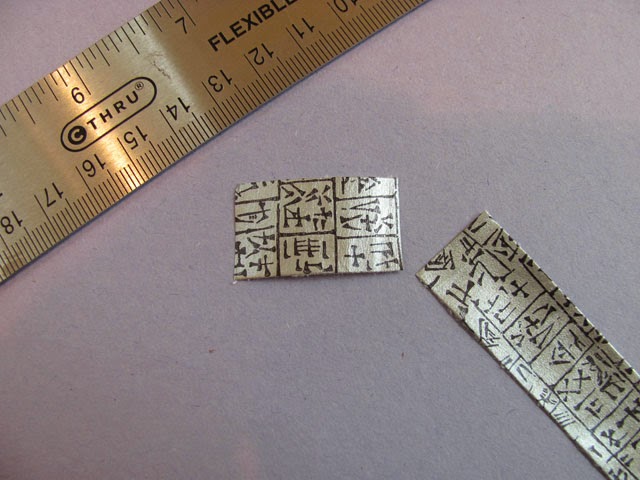
2. When the paint is dry, stamp your design onto it with permanent black ink. (Alternately, you could hand paint a design. Just be sure you keep the design small in scale.) Here I've used a Judikins rubber stamp featuring small alphabetical marks from an ancient language.
3. Allow the ink to dry thoroughly. In my humid climate this can take as long as an hour.
4. Cut a strip 3/4" wide from the painted paper, just as you did for the cardstock.
5. Trim off a piece that's just long enough to wrap around the base bead with little or no overlap. I try to cut precisely enough so the two ends butt snugly together with no gaps between them.
6. Glue the painted strip onto the base bead, keeping the edges aligned:

7. Wrap a small piece of tape around the toothpick just below the center. This creates a "stop" that keeps the bead from sliding down onto your fingers as you paint it. Place the bead on the toothpick:

8. Holding the bead upright, paint one end of the bead with Carbon Black acrylic paint using the 1/8" flat paintbrush. Let dry. Turn the bead over and paint the other end. Let dry.
9. Apply a couple of coats of clear acrylic varnish, allowing each coat to dry thoroughly between applications.

Text and images ©2014 Lynn Edwards
 |
| A basic painted paper bead |
Let's get started!
Your first step is to gather the materials. To make one bead you'll need:
(1) piece of plain white lightweight paper such as photocopy paper
(1) piece of white cardstock
Permanent black ink pad
Rubber stamp with small-scale design (Mine is from Judikins)
Toothpick
Bead roller (mine was purchased on Etsy)
X-acto knife and cutting mat OR scissors and paper cutter
Ruler
Glue (I use WeldBond Glue but Yes!Glue, Elmer's Original Glue or acrylic soft gel can also be used)
Small flat paintbrushes, 1/4" wide and 1/8" wide
Masking tape
Iridescent Silver acrylic paint
Carbon Black acrylic paint
Gloss acrylic varnish
Instructions:
Make the base bead
1. Using the paper cutter, or the X-acto knife and a cutting mat, cut a 3/4" wide strip of paper from the piece of white cardstock: |
| I used a Fiskar paper cutter to trim off a 3/4" wide strip which forms the base bead. |
3. Place one short end of the 7 1/2" strip into the slot on the bead roller. Make one or two turns with the roller, keeping the edges of the cardstock aligned.
4. Place a drop of glue on the cardstock to secure the paper. Roll the bead into a tight cylinder, using additional drops of glue every now and then as you roll to secure it.
 |
| Keep the edges of the cardstock aligned as you roll the base bead. |
 |
| A base bead finished and ready for a layer of painted paper. |
Make the painted paper.
1. Using the Iridescent Silver acrylic paint, apply a coat or two to one side of the photocopy paper. Make sure your coverage is even and there are no streaks. Allow to dry thoroughly. (Depending on how many beads you plan to make, you can cut the photocopy paper down to a smaller size before painting it. The piece I used, shown here, is about 6x6".)2. When the paint is dry, stamp your design onto it with permanent black ink. (Alternately, you could hand paint a design. Just be sure you keep the design small in scale.) Here I've used a Judikins rubber stamp featuring small alphabetical marks from an ancient language.
3. Allow the ink to dry thoroughly. In my humid climate this can take as long as an hour.
4. Cut a strip 3/4" wide from the painted paper, just as you did for the cardstock.
5. Trim off a piece that's just long enough to wrap around the base bead with little or no overlap. I try to cut precisely enough so the two ends butt snugly together with no gaps between them.
6. Glue the painted strip onto the base bead, keeping the edges aligned:
7. Wrap a small piece of tape around the toothpick just below the center. This creates a "stop" that keeps the bead from sliding down onto your fingers as you paint it. Place the bead on the toothpick:
8. Holding the bead upright, paint one end of the bead with Carbon Black acrylic paint using the 1/8" flat paintbrush. Let dry. Turn the bead over and paint the other end. Let dry.
9. Apply a couple of coats of clear acrylic varnish, allowing each coat to dry thoroughly between applications.
You now have a beautiful hand painted bead, ready to string!
Text and images ©2014 Lynn Edwards
Monday, March 17, 2014
How to Alter a Fabric Bead
Happy St. Patrick's Day!
Today we begin a series of posts to show you several ways of making your own beads. For our first post in this series, I'll be showing you how to take an existing fabric bead and changing its look entirely.
Why alter a bead after it has been created? There are lots of reasons. Maybe you don't particularly like the looks of it. Maybe you no longer wear the outfit the beads were made to match. Maybe your taste has changed and you want a completely different fashion look. Maybe you'd prefer to upcycle rather than discard.
In my case, I had a couple of surplus beads left over from this necklace project, below:
I was thinking it would be fun to experiment with ways to alter fabric beads, a topic I've not seen discussed before. The surplus beads presented a good opportunity to try out my makeover ideas.
Paint would be my "magic wand" in this little venture. The fabric I originally used to make the beads was a finely woven cotton so I knew it would absorb acrylic paint readily. For the makeover I wanted to go dramatically glitzy with a gold and black color scheme.
This is what the fabric bead, identical to those in the jewelry shown above, looks like after its makeover:
Here's how to give a fabric bead a whole new personality:
1. Start with a bead made from a single layer of fabric adhered to a rolled paper base. To make handling it easier, slide it onto a wooden toothpick with a "stop" made from a snippet of masking tape wrapped around the toothpick. The stop keeps the bead from sliding around and keeps paint off your fingers.
2. Holding the toothpick upright and using a small flat brush, apply a coat of bright Iridescent Gold fluid acrylic paint to the middle part of the bead. When it's completely dry apply a second coat. (If using regular, heavy bodied acrylic, thin it with just a bit of water so it's the consistency of heavy cream. This helps the paint soak into the fabric.)
3. When the gold paint is dry, use a small flat brush to apply Carbon Black acrylic paint to both ends of the bead.*
4. With a small liner or rigger brush loaded with Carbon Black, make tiny squiggly marks randomly on the middle part of the bead with just the tip of the brush. Or, if you prefer a different design, you could make dots, stripes...any pattern you'd like. Let dry.
5. Seal your bead with a coat or two of clear acrylic varnish.When the varnish dries, your made-over bead is ready to string.
*You don't have to use the same colors I've used. Use different colors, or a variety of colors if you'd prefer. Just be sure to use opaque paints. Transparent paints won't cover the bead's original design.
That's it for now. Have a great St. Patrick's Day! Saol fada chugat! which, in Gaelic, is "Long life to you!"
©2014 Lynn Edwards
Today we begin a series of posts to show you several ways of making your own beads. For our first post in this series, I'll be showing you how to take an existing fabric bead and changing its look entirely.
Why alter a bead after it has been created? There are lots of reasons. Maybe you don't particularly like the looks of it. Maybe you no longer wear the outfit the beads were made to match. Maybe your taste has changed and you want a completely different fashion look. Maybe you'd prefer to upcycle rather than discard.
In my case, I had a couple of surplus beads left over from this necklace project, below:
 |
| A couple of fabric beads like the blue and green bead above were left over from this necklace project. These extras were good candidates for a bead makeover. Notice I'm featuring a necklace that's perfect to wear on St. Patrick's Day, complete with Celtic spirals! |
Paint would be my "magic wand" in this little venture. The fabric I originally used to make the beads was a finely woven cotton so I knew it would absorb acrylic paint readily. For the makeover I wanted to go dramatically glitzy with a gold and black color scheme.
This is what the fabric bead, identical to those in the jewelry shown above, looks like after its makeover:
 |
| The bead sporting a whole new look. The fabric texture is now more noticeable, adding interest to its appearance. |
Here's how to give a fabric bead a whole new personality:
1. Start with a bead made from a single layer of fabric adhered to a rolled paper base. To make handling it easier, slide it onto a wooden toothpick with a "stop" made from a snippet of masking tape wrapped around the toothpick. The stop keeps the bead from sliding around and keeps paint off your fingers.
2. Holding the toothpick upright and using a small flat brush, apply a coat of bright Iridescent Gold fluid acrylic paint to the middle part of the bead. When it's completely dry apply a second coat. (If using regular, heavy bodied acrylic, thin it with just a bit of water so it's the consistency of heavy cream. This helps the paint soak into the fabric.)
3. When the gold paint is dry, use a small flat brush to apply Carbon Black acrylic paint to both ends of the bead.*
4. With a small liner or rigger brush loaded with Carbon Black, make tiny squiggly marks randomly on the middle part of the bead with just the tip of the brush. Or, if you prefer a different design, you could make dots, stripes...any pattern you'd like. Let dry.
5. Seal your bead with a coat or two of clear acrylic varnish.When the varnish dries, your made-over bead is ready to string.
*You don't have to use the same colors I've used. Use different colors, or a variety of colors if you'd prefer. Just be sure to use opaque paints. Transparent paints won't cover the bead's original design.
That's it for now. Have a great St. Patrick's Day! Saol fada chugat! which, in Gaelic, is "Long life to you!"
©2014 Lynn Edwards
Sunday, March 16, 2014
A Thought for Sunday
"At it's most basic, the spiritual is the experience of the connectedness that underlies reality. The depth of that experience depends on the capacity of the individual to set aside considerations of self, thereby gaining access to connection." -- Arthur Deikman
Saturday, March 15, 2014
Three Good Reasons to Make Your Own Beads
Making your own beads is so rewarding. If you make your own, you'll be able to create truly one of a kind beads you'll never see in a bead store or supply catalog.
These days I find myself making more beads by hand than ever before. Lately I've been making pieces like the one in the photo, completed just yesterday. It utilizes a single large handmade focal bead, accented by seed beads, barrel beads and glass rounds. But I also make necklaces that call for whole sets of handmade beads. These consist of five to nine large beads (for 20-24" strung necklaces) and several smaller matching beads for the coordinating earrings or bracelets.
Are you ready to make some beads? If so, don't miss my next several posts, in which I'll be showing you a variety of techniques and step-by-steps that will enable you to make beads that are uniquely YOU!
Text and image ©2014 Lynn Edwards
 |
| ©2014 Lynn Edwards |
Buyers love artistic jewelry
Handmade beads have a lot going for them. Nothing can substitute for their authentic, artistic quality. This is a strong selling point with buyers. I think people who like to buy handmade jewelry value it because they have a keen appreciation for an artist's skill and creative vision. They want to wear art jewelry that's distinctive and unique and carries something of the maker's spirit or persona. Those qualities are missing in the mass produced designs sold in major retail stores.These days I find myself making more beads by hand than ever before. Lately I've been making pieces like the one in the photo, completed just yesterday. It utilizes a single large handmade focal bead, accented by seed beads, barrel beads and glass rounds. But I also make necklaces that call for whole sets of handmade beads. These consist of five to nine large beads (for 20-24" strung necklaces) and several smaller matching beads for the coordinating earrings or bracelets.
Chill
Making beads is a satisfying, relaxing activity. Much of it is repetitive motion, and there's little if any stress to it. It's rather meditative, actually. So not only is bead making good for keeping your creativity going strong, it's good for your body and mind as well. It's very calming and then of course there's that nice sense of accomplishment when you step back and survey your handiwork. When someone loves your work and wants to buy it, that's a great feeling, too.Contain yourself
A third reason to make your own beads is cost containment. The focal bead pictured above would be pretty expensive to buy, even at wholesale. By producing it myself I have only a modest investment in materials. It's the time I must invest in its creation that's significant here. The first bead I made in this series took over three hours to complete. With practice I'm getting faster: this one took about two hours. I've now figured out some ways to streamline the process. So I expect to turn these focal beads out much faster as I implement those changes and naturally get better with practice.Are you ready to make some beads? If so, don't miss my next several posts, in which I'll be showing you a variety of techniques and step-by-steps that will enable you to make beads that are uniquely YOU!
Text and image ©2014 Lynn Edwards
Friday, March 14, 2014
Coming Soon: A New Style of Handmade Bead
All week I've been focused on making beads. For the last month or two I've been developing bead designs that go beyond the familiar rolled paper style. Last weekend, from out of the blue, I got an idea for a bead design I could hardly wait to try. I've now made several prototypes and I love the results.
These little gems have drawn oohs and ahhs and "Wow's!" from the handful of people I've shown them to so far. Of course this doesn't mean they're going to be a universal hit in all corners of the galaxy, but I'm very encouraged by other people's reactions to them.
Today was spent designing and stringing a choker-type necklace using one of the prototypes as the focal piece. I kept the overall design very simple because I wanted the bead to be the star. The choker, along with matching earrings, turned out even better than I had envisioned. Unfortunately I didn't have time to photograph them but will try to do this tomorrow so I can share pictures with you in my next post. Until then, all the best, and happy creating!
Thursday, March 13, 2014
The Blog Has a New Look!
Every woman deserves a makeover from time to time. And so does a blog. The old girl could certainly use an overhaul. When I ventured into Blogger's layout and template options, and found I could change its colors and fonts, I very nervously left my technological comfort zone (motto: "Leave well enough alone") and tried out a few options. Aha! I can do this! Much to my relief my tinkering hasn't seemed to do any damage.
The first thing I wanted to do was change the blog's color scheme. The blog's original pale blue has been traded in for teal and lime, colors that always remind me of being at the beach. With warm weather approaching they seem like timely choices. They also happen to be the same colors in the banner of my soon-to-be-launched Etsy store, opening next month.
Supposedly there are thousands of ways to dress up a blog if you know how. If you're a web site designer, don't worry about me competing with you. I'm still trying to learn how to use my Blogger dashboard, which I am told is so simple to use even toddlers can figure it out. Since the toddlers are miles ahead of me on the learning curve, I must rank down there with the brain dead armadilloes.
Changing some fonts and switching to new colors is about all I'm willing to tackle right now. It's a start, albeit a small one. Eventually I plan to add more gadgets and graphics but for now these changes are enough. So what do you think? Do you find the new look more appealing? Or did you prefer the original design? What would you like to see added in the future? Please share your thoughts!
©2014 Lynn Edwards
Wednesday, March 12, 2014
The Benefits of Painting with a Friend
Today being Wednesday, my friend Kathy (http://kathywoodworthart.blogspot.com) and I spent the day painting. We've been getting together to paint most Wednesdays for the last eleven years. We alternate locations, taking turns traveling between each other's studios. This involves advance planning (What supplies should I take? What am I likely to need?) and no small amount of physical exertion. Lugging stuff from studio to car and then from the car into the other's studio calls for effort. But that effort is totally worth it.
Painting together one day a week benefits us both in many ways. It helps rekindle our motivation when our muse has seemingly gone AWOL. It can be easy for an artist to succumb to a creative slump when they work in isolation, but slipping into that netherworld is much less likely when a friend is there to offer input and encouragement. Because Kathy and I are both abstract painters, there's a commonality of understanding between us relating to aspects of our work that makes explanations unnecessary.
Another benefit is that having a standing date to paint is an antidote to procrastination. As in, "I'll start that new canvas/experiment with inks/make collage papers/try that medium etc. etc. tomorrow when I have more time." When you know you have a set time to paint together, there's plenty of time. Procrastination isn't an option, and the excuse of being "too busy" doesn''t hold up. In six dedicated hours you can get an amazing amount accomplished.
Just being in another artist's studio can open one's eyes to new possibilities. When I visit Kathy's studio, I see her works in progress (always interesting!) and peruse newly finished pieces on her walls. Sometimes it's a combination of colors she's used that sparks an idea for a new jewelry design I go on to develop. Sometimes browsing the titles in her bookcase leads me to try a new painting technique. Kathy might say she experiences a similar phenomenon when she comes to my studio. A studio environment that's not your own can generate plenty of artistic curiosity and creative inspiration.
Last but not least, there's the benefit of camaraderie. In the many years we've been meeting each week, we've supported each other through difficult times, celebrated each other's achievements and commiserated over life's inevitable ups and downs. Eleven years' worth of Wednesdays. Eleven years of a cherished, enduring friendship. Eleven years of mutual support. Eleven years of laughter. It just doesn't get any better than that!
©2014 Lynn Edwards
Tuesday, March 11, 2014
Seeing the World Through an Artist's Eyes
"...To stop rushing around, to sit quietly on the grass, to switch off the world and come back to the earth, to allow the eye to see a willow, a bush, a cloud, a leaf, is an 'unforgettable experience.' " --Frederick Franck
As artists, we excel at being hyper-observant of everything around us. We study the graceful curve of the coffee mug's handle, and we notice when the goldfinches at the feeder start shedding their winter drab for the mating season's brighter plumage. We see the tiny purple flower peeking up from a crack in the sidewalk, and we see breathtaking abstracts of patterns and colors in a rusty piece of farm equipment.
When I taught painting to adults at KSU, I used to give my classes a handout titled "How to See Like an Artist." It contained tips and exercises for opening one's eyes to the physical world. Inevitably people would come to class the following week bubbling over with excitement. One woman described studying late afternoon cloud formations and noticing for the very first time their amazing range of colors, including yellow, gold, peach, orange, lavender, even green. "I never really looked at them before," she said. "Now I can't stop looking! Everything around me looks so different now!"
Among most of the artists I know, the habit of careful observation underlies much more than a desire to achieve a high level of technical skill. This heightened awareness of the world around us is almost a spiritual thing, a sense of connectedness to something infinitely richer and more complex than words can describe.
The artist glimpses something more than just a cup. That "something" is ineffable and impossible to describe, but it's there. What is learned through observation informs our experiences and thoughts, the internal processes that give rise to creative expression. We may never paint an image of that cup (or the cloud, or anything else we pay close attention to) but inevitably taking the time to observe it will, in some small way, shape our work and nourish our spirits.
©2014 Lynn Edwards
As artists, we excel at being hyper-observant of everything around us. We study the graceful curve of the coffee mug's handle, and we notice when the goldfinches at the feeder start shedding their winter drab for the mating season's brighter plumage. We see the tiny purple flower peeking up from a crack in the sidewalk, and we see breathtaking abstracts of patterns and colors in a rusty piece of farm equipment.
It's all in the details...
Noting details most people are oblivious to is an everyday experience for an artist. Far from being merely a casual pastime, it's an essential skill for us. For example, if we remained oblivious to the shapes or colors of shadows, how could we hope to depict them realistically in a painting? If we didn't study the movement of the waves, how could we render them convincingly on canvas?When I taught painting to adults at KSU, I used to give my classes a handout titled "How to See Like an Artist." It contained tips and exercises for opening one's eyes to the physical world. Inevitably people would come to class the following week bubbling over with excitement. One woman described studying late afternoon cloud formations and noticing for the very first time their amazing range of colors, including yellow, gold, peach, orange, lavender, even green. "I never really looked at them before," she said. "Now I can't stop looking! Everything around me looks so different now!"
Among most of the artists I know, the habit of careful observation underlies much more than a desire to achieve a high level of technical skill. This heightened awareness of the world around us is almost a spiritual thing, a sense of connectedness to something infinitely richer and more complex than words can describe.
A coffee mug's story
Take the aforementioned coffee mug, for instance. Look at it carefully and closely. Its dishwasher-worn finish tells of years of daily use, of thousands of morning risings, of a lifetime's worth of day-starting rituals. Its matte ceramic surface is darker in one spot where a thumb has rested every day. This humble mug is a veteran, a survivor. It holds stories and memories. It has witnessed much in its two decades of faithful service. To most it's just an ordinary cup, nothing noteworthy. But an artist truly sees it. He or she reads the clues.The artist glimpses something more than just a cup. That "something" is ineffable and impossible to describe, but it's there. What is learned through observation informs our experiences and thoughts, the internal processes that give rise to creative expression. We may never paint an image of that cup (or the cloud, or anything else we pay close attention to) but inevitably taking the time to observe it will, in some small way, shape our work and nourish our spirits.
©2014 Lynn Edwards
Monday, March 10, 2014
A Color That Makes My Heart Sing
The other day my Hubs commented that for someone who doesn't like brown, I seemed to use a lot of it in my work. (He was looking at two of my earlier pieces.) Actually, I don't like brown very much although I did wear a brown sweater this past Saturday. Only because it was lightweight enough to not feel like a horse blanket in Saturday's warm temperatures. To dress up the sweater I wore one of my Zentangle-inspired necklace and earring designs in black, brown and tan.
I do admit I've turned out a handful of paintings in which shades of brown were used fairly heavily, but do I go to brown as an automatic default? No. But many people do like brown. They like to wear it and decorate their homes with it. So I try to meet their expectations by painting or designing things to satisfy their tastes. Just as I do for those who love blue, red, purple, etc.
One color I do use a lot is Golden Paint's Quinacridone Nickel Azo Gold. It's a wonderfully rich, transparent color that when washed over a surface can convey the impression of antiquity like no other color can. Add a drop or two of umber (notice I said "a drop or two" not a cup!) and the antique effect is heightened even more. But making a surface look aged isn't QNA Gold's only use by any means. This is a color that produces stunningly beautiful glazes. When mixed with other transparent colors, the effects are luminous. For example, here's a mixed media collage, titled The Mountain Lark, in which I used QNA Gold to make the warm tones glow :
QNA Gold is a must-have color for me. I can't imagine my palette without it. It has been a mainstay of mine since day one. I'm not the only artist who loves this color; it's extremely popular so it's not unusual to find the store shelf empty when you go to buy some. My solution is to to buy it in 16 ounce bottles. That's enough to last me quite a while. If my Hubby comments that I seem to use QNA Gold an awful lot, I'll have to admit he's absolutely right!
Text and image © 2014 Lynn Edwards
I do admit I've turned out a handful of paintings in which shades of brown were used fairly heavily, but do I go to brown as an automatic default? No. But many people do like brown. They like to wear it and decorate their homes with it. So I try to meet their expectations by painting or designing things to satisfy their tastes. Just as I do for those who love blue, red, purple, etc.
One color I do use a lot is Golden Paint's Quinacridone Nickel Azo Gold. It's a wonderfully rich, transparent color that when washed over a surface can convey the impression of antiquity like no other color can. Add a drop or two of umber (notice I said "a drop or two" not a cup!) and the antique effect is heightened even more. But making a surface look aged isn't QNA Gold's only use by any means. This is a color that produces stunningly beautiful glazes. When mixed with other transparent colors, the effects are luminous. For example, here's a mixed media collage, titled The Mountain Lark, in which I used QNA Gold to make the warm tones glow :
 |
| "The Mountain Lark," collection of Mr. and Mrs. T. Powell |
Text and image © 2014 Lynn Edwards
Saturday, March 8, 2014
Decorating with Art
This weekend we have company arriving from out of state. Where is Martha Stewart when I need her? My house is a wreck! This is because housework always takes a back seat to studio time when it comes to my priorities.
One bad habit of mine is hanging older works and newly completed pieces haphazardly all around the house. With folks coming for a first-time visit I thought it would be nice to get things better organized. I targeted one particular wall in our living room for a makeover. Until Tuesday it had been devoid of everything but a credenza supporting a TV. It was ripe for a rehab. My plan was to create a "salon" of artwork there.
The television already occupied a fair amount of the available space. Then -- surprise! -- it became necessary to place a tall bookcase next to the credenza. (Formerly the bookcase had been awkwardly located in a hallway.) With the addition of the bookcase the available wall space for art was dramatically reduced. This forced me to pare down my choices.
I finally settled on three pieces that played well together visually. They're all bright, lively abstracts, matted in black frames.
To balance the "weight" of the bookcase on the left, I hung the 16x20 (titled Love, Mom) directly over the TV. This left the wall space above the bookcase and a 24 inch wide vertical space between the television and the bookcase. To fill the vertical space I hung a small, horizontal format abstract (Hand in Glove) and topped it with Dragonfly, a small vertical format abstract. A banker's style desk lamp with a green glass shade repeats the green in the painting directly above it.
For a while I considered hanging a fourth painting over the bookcase, but eventually decided to put a decorative candle holder there instead. The candle holder serves as an accent but is neutral enough to keep the attention on the artwork.
I think the grouping works for a couple of reasons. First, the art pieces look harmonious together, although they're distinct from one another. Two are mixed media collages and one is a painting. All feature a warm color palette, but one is predominantly red, a color repeated, to a lesser degree, in the other works.
Second, there is unity as well as variety: the frames are related to one another by the color black but each frame is a different size, style and material. Also, the trio's proportions differ, creating additional interest, yet their shapes and positions balance one another. You could say it's a grassroots example of the Elements and Principles of Design applied to decorating.
This project turned out much better than I expected. The once-boring wall is now interesting. The combination of books and art illuminated by lamplight brings a formerly dark area of the room to life. And the three pieces of art are now displayed where they can be seen and better appreciated. This has nudged me to look for ways to extend that consideration to artwork in the rest of the house. I foresee more decorating projects in my future...!
Text and image ©2014 Lynn Edwards
One bad habit of mine is hanging older works and newly completed pieces haphazardly all around the house. With folks coming for a first-time visit I thought it would be nice to get things better organized. I targeted one particular wall in our living room for a makeover. Until Tuesday it had been devoid of everything but a credenza supporting a TV. It was ripe for a rehab. My plan was to create a "salon" of artwork there.
The television already occupied a fair amount of the available space. Then -- surprise! -- it became necessary to place a tall bookcase next to the credenza. (Formerly the bookcase had been awkwardly located in a hallway.) With the addition of the bookcase the available wall space for art was dramatically reduced. This forced me to pare down my choices.
I finally settled on three pieces that played well together visually. They're all bright, lively abstracts, matted in black frames.
For a while I considered hanging a fourth painting over the bookcase, but eventually decided to put a decorative candle holder there instead. The candle holder serves as an accent but is neutral enough to keep the attention on the artwork.
 |
| The "after" photo. |
I think the grouping works for a couple of reasons. First, the art pieces look harmonious together, although they're distinct from one another. Two are mixed media collages and one is a painting. All feature a warm color palette, but one is predominantly red, a color repeated, to a lesser degree, in the other works.
Second, there is unity as well as variety: the frames are related to one another by the color black but each frame is a different size, style and material. Also, the trio's proportions differ, creating additional interest, yet their shapes and positions balance one another. You could say it's a grassroots example of the Elements and Principles of Design applied to decorating.
This project turned out much better than I expected. The once-boring wall is now interesting. The combination of books and art illuminated by lamplight brings a formerly dark area of the room to life. And the three pieces of art are now displayed where they can be seen and better appreciated. This has nudged me to look for ways to extend that consideration to artwork in the rest of the house. I foresee more decorating projects in my future...!
Text and image ©2014 Lynn Edwards
Tuesday, March 4, 2014
More Portable Art: A Collage Card Made From Scraps

If you look closely you'll see some of these "found" papers were painted on or overstamped. Such was the case with the bee in the lower left corner. I used a small rubber stamp to create the bee, which relates to the insect motif in the upper right corner. Doing a little painting or stamping is a good way to jazz up a plain piece of paper that's just the right color but needs a bit of pattern to fit the overall design.
What's nice about small scale projects like this is their portability. Everything you need (paper scraps, a small scissors, a glue stick, color markers, maybe a tiny rubber stamp or two) can fit into a little box or pouch. The compact nature of this project makes it easy to create cards while watching TV or sitting in a waiting room. It's proof we don't need a big fancy studio -- or even a little studio -- to be creative. Art can be made anywhere!
Monday, March 3, 2014
Make a Greeting Card From Scraps

This is a card I made one day when I was looking for a project that wouldn't take hours to create. I started with a blank white note card by Strathmore, and a slightly smaller piece of acid free black card stock to act as a background for the collage pieces.
On my work table was a page torn from an old phone book. I had used it under another project to protect the table top, and I liked the red paint marks on it. So I included it in the collage. The rest of the elements are bits of paper and numbers and letters I had snipped from various sources. (Magazines and junk mail yield lots of them.) A good quality glue stick was my adhesive.
The bumpy looking white circle is actually part of a label from a plastic soft drink bottle to which I had applied heat. This caused the plastic to shrink up and form puckers. The textural quality it adds gives the design extra interest, I think.
All of the components of this little collage were bits and pieces of things I already had on hand. It came together very quickly (in about the same amount of time it has taken me to write this post.) The recipient loved it and said she was going to frame it.
There's no need to buy special supplies for making cards like these. The"ingredients" are all around you. Pull out your scissors, grab some old flyers or magazines, and see what you can come up with. You'll end up with a unique little art piece to give someone, while honing your compositional skills and flexing your imagination. So have some fun! Create!
Text and image ©2014 Lynn Edwards
Sunday, March 2, 2014
Gorky and Kandinsky on Abstract Painting
From my growing collection of quotes on abstract art, here are two from painters whose work I admire:
"Abstract art is the emancipation of the mind." -- Arshile Gorky
"Of all the arts, abstract painting is the most difficult. It demands that you know how to draw well, that you have a heightened sensitivity for composition and color, and that you be a true poet. This last is essential." -- Wassily Kandinsky
Subscribe to:
Posts (Atom)